The Universal Design for Learning (UDL) approach is critical whether you teach entirely online, hybrid, blended, hyflex, or face-to-face classes. A good course starts with a road map and inclusive accessibility guidelines to ensure an optimal environment where teaching and learning are empowered. The UDL principle addresses the abilities and needs of all learners while eliminating any possible hurdles. A learning environment can impact many learners; as every learner is different, everyone deserves an equitable opportunity to access the content.
Accessibility is for all learners, not only those who self-identify as needing accommodations or alternate content. For example, learners may be distracted, attend courses in noisy environments, have a spotty internet connection, experience limited ability to use equipment due to an injury, and other impairments. Therefore, creating content with accessibility at the forefront of the design process versus retrofitting on the back end helps everyone.
Inclusive design starts with a learner-centered approach that embraces diversity (welcoming differences, creating understanding, using appropriate language, discussing biases, freeing assumptions, and showing empathy). The best course design allows users to learn from diverse resources that can be accessed anytime and provides different learning modalities and solutions that fit all learners.
Web Content Accessibility Guidelines 2.1 (WCAG 2.1) was developed through the W3C process and has set standards for designing accessible content. The basic accessibility principles start with POUR:
- Perceivable - Content must be present in the form where the user can perceive it, auditorily and/or visually.
Examples: adaptable content, text alternatives, alt tags in images, etc. - Operable - The user interface, such as buttons, navigation, and all components, must be operable.
Examples: keyboard access, slow-moving content, streamlined navigation, etc. - Understandable - Learners should be able to understand, comprehend, learn, and remember.
Examples: the text is readable and easy to understand, know your audience and their specific requirements, predictable layout, etc. - Robust - Content is created that allows for a wide variety of user agents, such as assistive technologies in different environments.
7 Pillars of Accessibility
7 Pillars of Accessibility are guidelines we use to create accessible content. They encompass headings, alt tags, descriptive links, color, lists, tables, and closed captions.
Headings
Headings are text formatting styles used to communicate the organization of the content within a page. They provide a structure and outline and allow screen readers and other assistive technology to scan the content page just like sighted users.
Tips
- Do not use headings to format the text
- Avoid standalone headings - with no paragraph text below
- Consistency! If you use H2 in bold, then make all H2 bold throughout
Alt Tags
Alt Text or Alt Tag is a written (short and concise) description of non-text content on web pages. Alt Text/Alt Tag is essential for accessibility as the screen reader will read the description in place of an image and display the description if the image is not loading in the browser.
Tips
- Exclude the phrase "an image of" or "a picture of" as the screen reader will indicate it's an image
- Remove the file type extension from the alt text (.jpg, .png, etc.)
- Consider personal identifiers and positional information (a glimpse of, a partial view, etc.)
Descriptive Links
If the link is posted as the URL address, the screen reader will read a raw link letter/number/symbol by a letter/number/symbol, one by one. Therefore, it is best to describe a link as a descriptive phrase, not a sentence, to avoid confusion. The descriptive phrase should consist of the keywords identifying the item.
Tips
- Avoid linking ambiguous phrases such as "click here," "go here," "learn more," "read this," "start," etc., as these don't convey where the hyperlink will take users
- Screen reader typically announces a "link" before reading the actual link
- Do not post raw URLs
Color
Text and color background (foreground) need to have sufficient color contrast. Learners who are legally blind, visually impaired, or have color vision deficiency may not be able to identify text in color, emphasized text, or highlighted portions of the text. Using color as the only way to convey meaning is insufficient to meet accessibility standards. Color can be used to convey meaning as long as that meaning is also indicated in some other way, such as using italics, bold, a symbol, an identifier, etc.
Tips
- Canvas Accessibility Checker will alert you if there is not enough contrast
- It's okay to use color as long as the meaning is indicated in some other way
- Add textual reference when describing images or referring to the color on images
Lists
Lists are used to itemize related items. An ordered list may have a numerical or alphabetical hierarchy. An unordered list has no hierarchy and should be bulleted.
A "fake" list is created manually simply by hitting a hard return to a new row or by assigning a number, Roman numeral, or a letter. However, the screen reader will not announce the list or the items in it as a list.
Tips
- Lists should be created using the RCE "list tool"
- Use an ordered list when the order of the list is important (displayed in numerical or alphabet style)
- Use an unordered list when the order of the list doesn't have a particular order (displayed in a variety of bullet styles)
Tables
Tables are preferred when the content is more complex and requires organizing data. A table is a systematic arrangement of data in rows and columns.
Table scope identifies a caption (title of the table) and whether the cell is a header for a row, column, group of rows, or columns and rows. A header row is a top row in the table in which the individual cell describes the content in the cells that fall directly below. A header column is a left-most column that describes the content in the rows directly to the right.
Tips
- Do not use tables to format content (layout, headings, paragraphs, textbox, etc.)
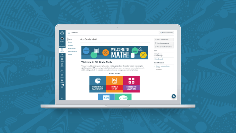
- Do not use tables to style images (e.g. Home Page buttons)
- Manually styled tables with added color or highlighted cells do not meet accessibility requirements
Closed Captions (CC)
Audio and video files must be accompanied by complete and accurate transcripts and closed captioning containing proper punctuation, capitalization, and word matching. Captions provide dialogue or a narrative, and audio descriptions provide a non-verbal explanation of what's happening on the screen.
Captions can be open captions (burned into the video that cannot be turned on or off), or closed captions (on-screen text that can be turned on or off).
Tips
- Avoid using auto-generated or open captions, which are not sufficient for accessibility
- Captions are not read automatically by a screen reader; you need to provide instructions ahead of the video on where to access them
- ADA best practices require captions to be 99% accurate, which is approximately an error every two to three sentences
A11y (Accessibility) Resources
- Accessibility Fundamentals
- Write good Alt Text to describe images
- Contrast & Color
- Creating Accessible Tables
- Captions/Subtitles
Final Thoughts
Before learning more about accessibility, I had in the distant past spent 376 hours redesigning and remediating accessibility errors in a 3-unit college course (prior to my time at Instructure), so please learn from my hard-won experiences when I say that you will spend less time designing a course if you begin with accessibility at the forefront of the process instead of applying a time-intensive retrofit on the backend. The most important result of this endeavor is that you will be creating an engaging experience for all your learners.
Accessibility may at times seem overwhelming and time-consuming, but know that by having an open mind and heart, empathy, and celebrating diversity and inclusion, you will create new generations of independent and empowered learners! Because accessible course design matters, we all have a critical role to play in spreading its awareness!
About the Author
Saša is a Canvas Instructional Designer and a passionate Accessibility Advocate. Prior to working at Instructure, Saša was a Health and Kinesiology Instructor for multiple districts in the Los Angeles area as well as a Distance Education Coordinator. Besides her passion for all things distance ed and accessibility, Saša loves fitness, cooking, sewing, and salsa dancing.
Related Content
 philippines_ched_cmo.png
Blogs
 meet-canvas-apac-team-avi.png
Blogs
 mom_and_baby_with_laptop_2.jpg
Blogs