Our students have been through a lot over the past few years, and the impact of these challenging times is widely recognized. As an unprecedented number of students are now engaging in some form of online learning, it’s a good time to be asking:
What can we do to make it easier and more satisfying for students to engage in online courses?
Now that our efforts have shifted from merely getting everything online to optimizing the online learning experience, a focus on usability in course design is an important aspect of any quality improvement effort.
What is Usability?
Generally speaking, usability is a quality attribute that assesses how easy and satisfying something is to use.
In the context of online learning, a focus on usability means enabling students to easily engage with the course materials, and removing the obstacles that may stand in the way of that experience. More practically, in striving to improve the usability of online courses, we might examine:
- How easy and efficient is it for students to find what they need?
- Are students spending time trying to make sense of the structure of the course instead of on the learning materials themselves?
- Can students easily engage in their online course on a mobile device, in a noisy space, with a disability, or in other situations that may pose challenges?
To be clear, we’re not suggesting that usability should make the course itself less challenging, but rather, it should ease the effort required to participate in the learning experience, and to make that experience more satisfying overall.
But How?
While most course designers would agree that striving for usability is a worthwhile goal, it’s not something that most faculty, instructors or even instructional designers have a lot of experience with.
The good news is that you don’t have to be a user experience design expert to build usability into your Canvas courses.
Let’s explore three keys to designing highly usable Canvas courses that everyone can incorporate:
- Establish consistency. When the structure of a course - meaning, the specific ways in which materials are presented - is consistent, students are able to focus on the content itself instead of on making sense of how the course works. We can establish consistency by ensuring every module or unit in the course follows the same pattern, icons represent the same thing each time they are used, and naming conventions are adhered to. When consistency can also be established across courses (not only within courses), it becomes even more helpful for students.
- Eliminate clutter. In order to ensure students can easily find what they need and efficiently accomplish tasks throughout the course, it is important to channel your inner Marie Kondo and go for a clean and well-organized course design. For example, in an uncluttered course, items are clearly labeled, content is presented in manageable chunks, and the visual design is clean with ample whitespace. All of these elements of course design reduce the cognitive load on students, allowing them to more fully engage with the learning.
- Remove obstacles. All students face barriers in engaging in online courses, whether it be a noisy space, poor internet connectivity, a visual or auditory impairment, or any number of other challenges. When we focus on usability, we are aiming to understand and remove as many of those obstacles as possible. What’s great about this concept is that removing one obstacle, such as ensuring a course has sufficient color contrast, benefits many different types of students including those who are accessing the course from a brightly lit space (outdoors) to those who may have a visual impairment. Similarly, ensuring videos have captions is an improvement that not only benefits students with auditory challenges, but is also helpful to English language learners or students learning in a shared space.
Following these simple guidelines when designing an online course will help make it easier and more satisfying for students to engage with the course.
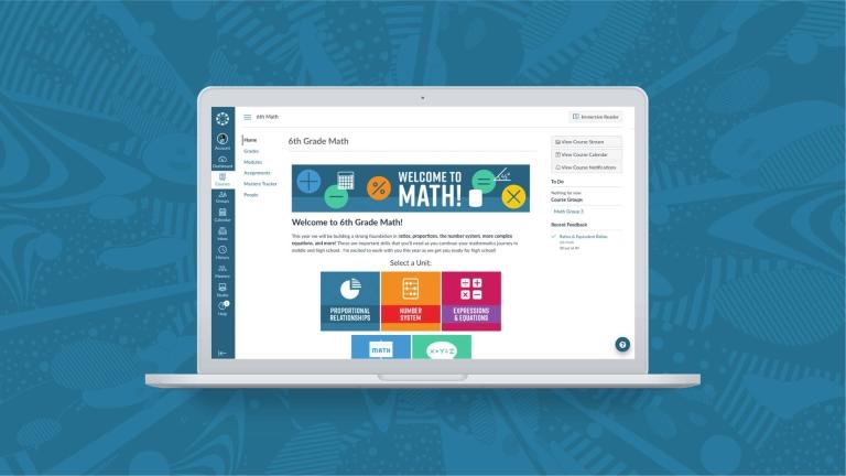
Before and after transforming a Canvas course page with a focus on usability.
Let’s Do This!
For more practical tips and examples that will help you easily apply these concepts to your course, join our session at InstructureCon: “Easy Does It! Usability in Online Courses to Increase Student Engagement” on July 14 at 11:40 AM (MT). In this 20 minute presentation, you’ll also see how tools from Cidi Labs can help course designers build highly usable, accessible and engaging Canvas courses - without any html or css skills. Easy peasy all around!
To learn more or schedule a more in-depth demo, you can also visit cidilabs.com.
Related Content
 Teaching-With-Tech-10-Benefits.jpg
Blogs
 wooclapft.png
Blogs
 lincolnlearning.png
Blogs