When building your courses in Canvas, it’s essential to design with the Universal Design for Learning (UDL) principles in mind to ensure all content and activities are accessible for your students. We were lucky enough to be joined by Andrea Earl and Christian Miraglia at InstructureCon 2022. Their session provided quick tips and best practices for building equitable courses using tools from right within Canvas LMS.
What is UDL?
Universal Design for Learning (UDL) is a framework developed by CAST, an Understood founding partner. UDL guides the design of learning experiences to proactively meet the needs of all learners through its three guiding principles; engagement, representation, and action and expression. These UDL principles were created to help educators anticipate a range of variability among students and plan for this variability in both lesson plans and course design.
Your UDL Checklist for Equitable Design in Canvas LMS
Make a positive first impression.
- Dashboard: Use an engaging image that can serve as a quick visual reminder of what your course is about.
- Names and titles: Be sure to make important course details such as the subject, instructor, and year visible to students from the dashboard to limit distractions.
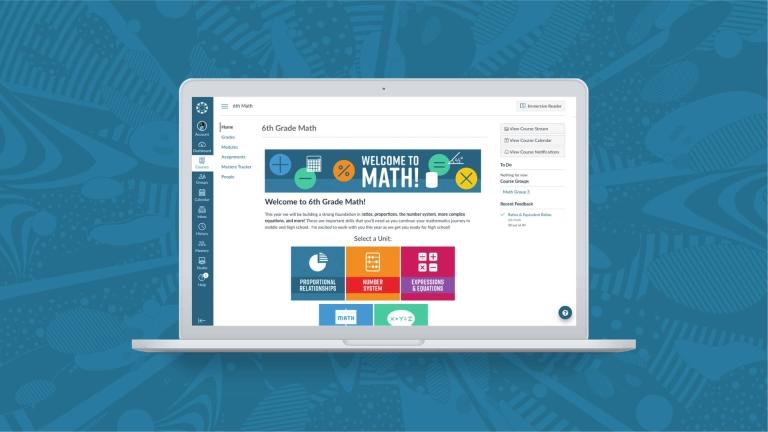
- Homepage: Create a purposeful homepage that includes course information, content, and activities that are easy to find. Limit clicks and scrolling!
- Student view: If you aren’t sure how something will look from a student’s perspective, use the “Student view” mode to check your work.
Organize course content & improve navigation
- Tabs: Limit the number of visible tabs in each course to simplify course navigation. Start with the essential tabs such as Announcements, Modules, and Grades, then add from there as needed.
- Modules: Use a consistent module format for students and organize Modules by weeks or units.
- Assignments: Number your assignments to improve navigation and use keywords to further indicate the topic, standard, or subject.
- Order and prioritization: Ensure that modules and assignments are arranged in chronological order so students can quickly identify the next section that needs their attention.
Create opportunities for connection & interaction
- Instructor Presence: Introduce yourself and the course with a video welcome message and include a page where students can easily find your bio and contact information.
- Feedback: Grades are inevitable. Feedback is personal. Leave personalized comments for each student using recorded audio or video.
- Announcements: Post weekly announcements with important reminders and personal messages to your students.
Remove learning barriers
- Alternative text: Use the alternative text on images to describe what is in the photo to ensure all students can access the image.
- Accessibility Checker: Ensure that your font sizes, colors, and content organization is compatible with how your students learn.
- Hyperlinks to words and phrases: Use hyperlinks to help students gain additional insight and context to words or phrases within a specific unit.
- Detailed instructions: Remember that everyone learns a little differently, so make sure your instructions reflect that! If you are used to only providing written instructions, try recording yourself in a video or audio clip explaining the instructions to students as you would in class.
We hope you found these quick tips useful! For additional context and resources, watch the full session.
Related Content
 Teaching-With-Tech-10-Benefits.jpg
Blogs
 cidilabs.png
Blogs
 canvas_x_tg_logo_lockup_780_x_520.png
Blogs
