With more teachers using a learning management system (LMS) than ever, especially since the pandemic, students and their families face a new problem: Accessing materials, resources, and activities digitally can look very different from class to class. With up to eight classes per semester, students are getting lost within their own LMS. That’s because many teachers design the pages and experiences that appear on their LMS in isolation and without much consideration for their student users.
Last spring, Portland Public Schools, in Portland, Oregon, began the work necessary to help teachers intentionally design their learning management system’s layout so that students can easily access everything they need. But how do you begin this work?
Starting with a small group of classroom teachers and teachers on special assignment, such as me, Portland Public Schools created an LMS steering committee to guide and align teacher design practices. The folks who made up this committee had a range of experience with using an LMS—some were just getting started, and others were very familiar with the ins and outs of LMS design. The connection that tied everyone together was a desire to make using an LMS easier to navigate for their students and families. Here’s an outline of the work we engaged in and a look at the end result.
Aligning LMS Design Across a School or District
Day 1: We started by reading over other districts’ work on aligning their learning management systems. We took notes on what we liked and didn't like and what we could expand upon.
This first step we took was a review of what other school districts were doing to help their staff design and organize an LMS presence. The Oregon Department of Education facilitates a monthly LMS administrators group from across the state. We reached out to this group and were encouraged that a few other districts had already engaged in some of this work. After compiling a list of collected resources, we shared it with our steering committee and asked them to take notes on what they found to be useful, what was not in line with our values, and what they wanted to elaborate upon.
Day 2: We mapped out what we would like to see in our user agreement.
After taking time to look over other districts’ LMS user agreements, we decided what we would like to see in our own. We began by reading technology integration teacher Sarah Schroeder’s article “Designing Your LMS to Make Distance Learning Better.” We found Schroeder’s perspective of LMS design very empathetic to her students and their families. This article made even our most outspoken critic of standardization reconsider his position and gave us all an appreciation for our end users.
After our discussion, we moved on to a collective brain dump activity using Google’s Jamboard. Team members used their notes and this time for reflection on identifying what they liked, disliked, and thought was missing from the example LMS design agreements we shared.
As folks created their notes in the Jamboard, we used a visual marker to indicate what we agreed with or to add more text to continue a thought. Toward the end of this activity, we found several trends rising to the top of what folks wanted to see, and not see, in an LMS design guide. We ended up with suggestions that were important to Portland teachers, such as how to organize the layout, simplify the navigation options, and create a simple checklist to help teachers accomplish this work.
Day 3: On our last day, we discussed the first draft of the proposed agreements.
Facilitators used the steering committee’s input to create an initial draft of recommended school and classroom LMS user agreements. This input ranged from specific details of design to the vocabulary used. Once the initial draft was complete, it was shared with the steering committee. The last group meeting was spent editing and revising a final draft of our document.
We tried to spend our time focusing on what we thought was most necessary to help our district’s teachers align their design practices so that students and families would be able to understand how to utilize an LMS more easily, with less frustration and confusion. What we were really looking for was a consistent experience for students and families across subjects and grade levels, so that they could easily find what they needed, no matter whose LMS site they were on.
The resulting document consisted of a page of design suggestions and a page of resources to help support teachers in implementing those design suggestions.
The design suggestions reflected our team’s beliefs about what are the most important features for ease of navigation for students and families within an LMS.
Our suggestions included the following:
- Create a personalized course homepage with contact information, a welcome message, and a weekly schedule.
- Publish a course syllabus or an “about this class” page that includes learning targets and outcomes, grading policies, and what is expected of students.
- Use modules to deliver and organize content. On Canvas, modules break down a course into day, week, unit, topic, or outcome. We asked teachers to make sure these were up to date—including any pages, assignments, discussions, quizzes, or files for that unit—and unpublish future or past modules that students do not need.
- Communicate clearly with students and families by establishing clear and consistent guidelines, including using announcements to relay information to the entire class and direct messages for private conversations.
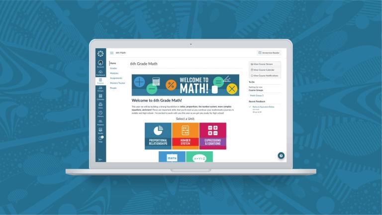
Our next steps included creating a shareable course template based on our recommendations, which would be available to all staff and give them an idea of the look and feel of the pages we were asking them to create. The recommendations were also shared with all secondary building administrators prior to the start of the new school year to share with staff. We were able to connect these recommendations to our district's instructional framework’s focus on equity.
As a result of this work, we are now able to help create the conditions for a consistent LMS user experience while allowing district stakeholders an additional avenue to align actions and resources to ensure equity of access to high-quality instruction across all schools, classrooms, and students.
Ryan Hoxie
Learning Technologies TOSA, Portland Public Schools
**This article originally appeared over on Edutopia. It has been reshared with permission.
Related Content
 Teaching-With-Tech-10-Benefits.jpg
Blogs
 cidilabs.png
Blogs
 canvas_x_tg_logo_lockup_780_x_520.png
Blogs